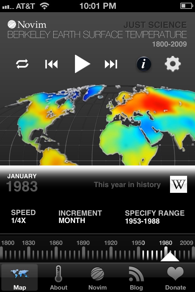
“Just Science” highlights the easy-to-understand video map of climate change recently released by the Berkeley Earth Surface Temperature (BEST) study.
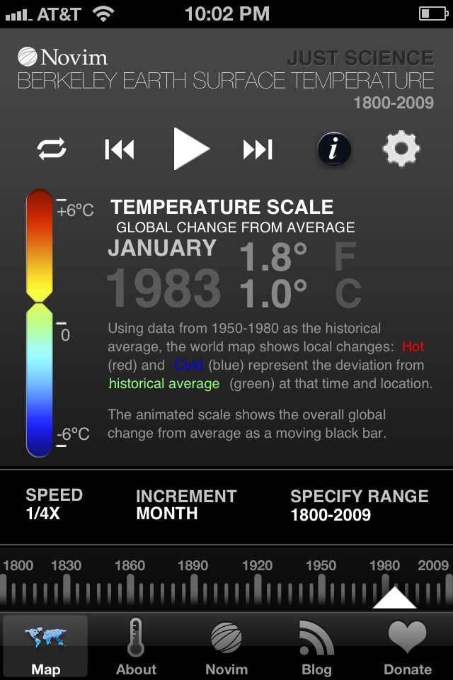
The app features a color-coded map of the world that displays how the Earth’s land temperature has changed between 1800 and 2009. Monthly data from local recording stations produce a red, green, and blue global visualization of the temperature’s deviation from historical average.
Dive into the rich graphical representation of how the temperature around you has changed since the Industrial Revolution. Let the colors speak for themselves. Skip getting your answers from difficult-to-understand scientific papers or politically-biased media pundits. Instead, spend 5-10 minutes with Just Science and you can see the patterns of climate change yourself.
The BEST study temperature data comes from 39,000 unique stations located around the world – more than five times the number of stations found in previous studies. Sources range from handwritten British logbooks originating from 19th century naval explorations to modern continuously monitoring digital stations, and the math is calibrated to know the difference.
Fueled by an aim to resolve widespread public and scientific criticisms of incumbent studies on the global surface temperature record (the key indicator of climate change), the Novim Group (www.novim.org) initiated and sponsored the BEST study (www.berkeleyearth.org) to conduct a new scientific analysis of global climate change.
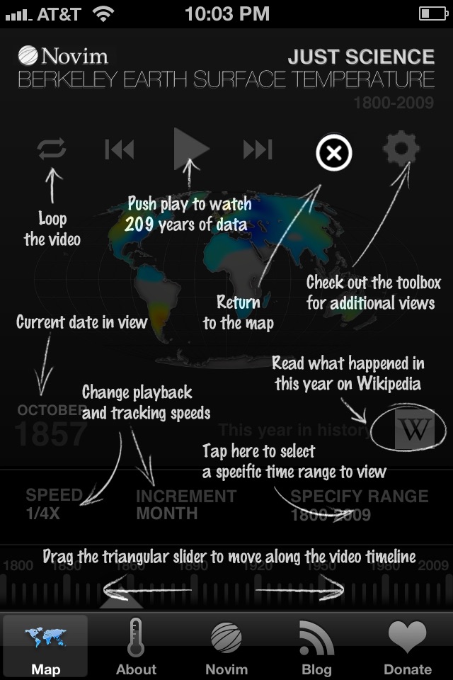
Using Just Science’s advanced custom-tailored features, you can:
• Interact with a color-coded video map of global climate change
• Explore details by zooming into continental regions
• Change playback speeds and increments to search for trends
• Visit Wikipedia to reference concurrent world history
• Follow Novim’s news articles
• Learn more about Novim and the BEST study


